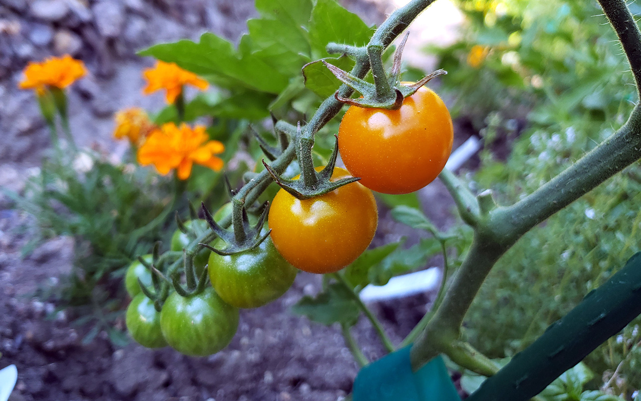
Sungold Cherry Tomatoes
Lorem ipsum dolor sit amet, consectetur adipisicing elit. Image 1 description.
This UI Kit is built using the Solo Design System (not related to my last name), which provides a comprehensive set of components and styles to create consistent and accessible user interfaces in my projects. The kit includes a variety of my pre-designed components such as buttons, cards, modals, and more, all adhering to best practices in design and usability.
A hero component that showcases key content and actions, with a visually striking background and prominent call-to-action buttons.
Front End Engineering Manager and Developer with 20 years of experience spanning engineering management, front-end development, design, sprint planning and estimation, and product management. Passionate about building high-performing, collaborative teams at the intersection of design, software, and product. Currently leveraging my years of experience to use the power of AI for Agentic and Spec Driven development.
Modular card layouts with header support, variant styling, and interactive hover/focus states for clear content grouping and visual hierarchy.
This card has a header with an icon and text.
This card has no header. Just content.
This card uses extra classes for variant styles.
The Loader component is a small, customizable spinner used for showing loading states. It accepts width, heightand border props (strings or numbers) and sets matching CSS variables (--loader-width, --loader-height,--loader-border) so the pseudo-element spinner can be styled consistently. Place the loader inside a centered container or use a positioned parent (e.g. position: relative) when showing an overlay.
Comprehensive button system supporting variants, sizes, icons, block layout, disabled and loading states, and full accessibility. Easily customized via props for label, icon, type, and more.
Flexible form and input system supporting text, selects, checkboxes, radios, sliders, file uploads, and validation. All controls are accessible, customizable, and support helpful messaging and state via props.
Client-side rules with inline messages, an error summary, and accessible states.
Debounced “email already taken?” check with loading state and accessible messages.
Accessible tab interface with ARIA roles, keyboard navigation (←/→, Home/End), focus management, and horizontal scrolling for overflow. Only one tab panel is visible at a time, and all controls are screen reader friendly.
Accessible accordion component with ARIA roles, keyboard navigation (↑/↓, Home/End), and smooth open/close animations. Only one panel is open at a time, and all controls are screen reader friendly.
Kickoff steps, discovery, and mapping of roles (RACI) to align the team on milestones and SLAs.
A multi-step workflow component with next/previous navigation, plus visual linear and circular progress indicators that update as you advance through each step.
Guided flow with validation per step. Reuses your modal system.
The ImageRotator cycles through an array of images on a configurable interval. Key props:
images — array of {src, alt}interval — rotation period in millisecondstransition — animation style (fade, slide, zoom, flip, kenburns, dissolve, crossfade, none)transitionDuration — animation duration in ms (controls CSS and timing)width / height — sizing; accepts numbers or CSS stringsThe component renders layered slides for smooth enter/exit animations and honoursprefers-reduced-motion. Remote images are left unoptimized in dev to avoid Next.js optimizer errors.
Cards as image placeholders. Use the arrows or drag/scroll. Snaps per card.
Interactive image slider with:

Context navigation with separators and responsive overflow.
A prominent call-to-action band for demos, downloads, or contact.
Get a demo tailored to your protocol and timelines.
Toasts are used to display brief, auto-dismissing notifications.
Short hints (hover/focus) and richer, non-modal popovers (click/ESC/outside).
Centered modal and slide-over overlay. Keyboard: ESC to close. Focus is trapped inside.
Quickly jump to UI Kit sections or run actions. Press ⌘/Ctrl + K or click the button to open the palette. Type to filter, use ↑/↓ to navigate, Enter to run, and Esc to close.
Type to filter suggestions and add tokens (Enter or comma). When the input is empty Backspace removes the last token. Use the Arrow keys to navigate suggestions and press Enter or click a suggestion to add it. Focusing the field shows recent suggestions when available.
Drag files here or browse. Shows basic validation and mock progress.
Drag & drop or browse. Shows live thumbnails with remove & size checks.
Linear score with thresholds + native <meter> styling. Drag to preview values.
Select start and end dates using the calendar or the quick presets. Click a day to set the start date, then click another day to set the end date (clicking an earlier day will swap start and end). Use the presets for common ranges and the Clear button to reset.
Use the arrow keys to move between days, Page Up/Page Down to move between months, Home/End to jump to the start/end of the week, and Enter or Space to select the focused date.
Pick a single date with “Today” and “Clear.”
Calendar opens on input/focus; ESC/outside to dismiss.
Small metric cards for dashboards and summaries.
Single-select and multi-select with chips. Arrow keys + Enter, click to choose.
Sortable columns, sticky header, and client-side pagination.
| ID | Phase | Version | Status | Task |
|---|---|---|---|---|
| 1000 | UI Design | I | Sprint Planning | 12 |
| 1001 | UI Development | II | In Review | 19 |
| 1002 | Accessibility Fixes | III | Deployed | 26 |
| 1003 | Bugs & Issues | I | Sprint Planning | 33 |
| 1004 | UI Design | II | In Review | 40 |
| 1005 | UI Development | III | Deployed | 47 |
| 1006 | Accessibility Fixes | I | Sprint Planning | 54 |
| 1007 | Bugs & Issues | II | In Review | 61 |
Reusable pager with first/prev/number/next/last, accessible keyboard shortcuts, and a page-size selector.
Toggle chips with counts, “Clear all,” and live results.
Removable filter chips with AND/OR logic and quick “clear all”.